Rise & Shine Wall Mirror

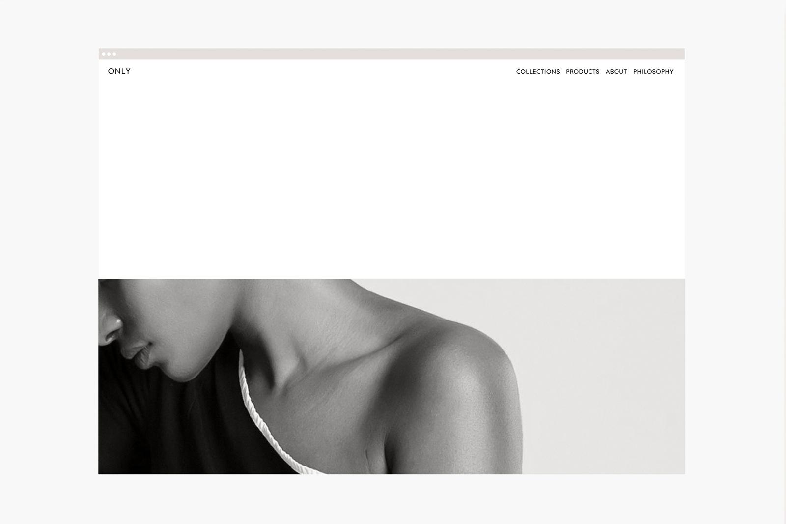
Only is a new cosmetics brand from Spain that uses fewer and carefully selected ingredients. The philosophy of less is more is used by the company for its cosmetics, so what name could fit better than Only to represent the brand?
Madrid-based graphic designer and art director María Hdez was commissioned to undertake the complete conceptual development, visual identity, and web design for Only. María explains to us:
The branding was designed on black and white with occasional support of yellow and blue, and with a very special attention to each detail that reflects the brand’s main values. My focus on this design is how consumers can easily know the ingredients and information of the products. The minimalist branding and packaging of these aids reinforces the brand’s clarity.The primary corporative colours represent the day creams; white, and the night creams; black, meanwhile the visual identity is geometric and functional, being inspired by suprematism and how they sought sensitivity through geometric abstraction.